
Why Bad Graphic Design Is Killing Your Digital Ad Conversions
Bad graphic design kills digital ad conversions because it fails within the first two seconds of a scroll: unclear hierarchy, mismatched branding and cluttered layouts stop people from understanding your offer before they've even read it. The fix is not a bigger budget. It's better graphic design services applied to every ad you run.
What Counts as "Bad" Graphic Design in an Ad?
Bad ad design isn't about taste. It's design that fails a specific job: getting a stranger, mid-scroll, to understand your offer and act on it. Common failure points include low contrast text, five competing fonts, a logo the size of a postage stamp, and a call-to-action button that blends into the background. If a design needs a caption to explain itself, it has already lost the sale.
How Do I Know If My Ad Design Is Losing Me Customers?
You're likely losing conversions to design if your click-through rate is respectable but your landing page bounce rate is high, if your cost-per-click keeps climbing without a matching rise in sales, or if your team can't agree on what the ad is actually selling within five seconds of looking at it. These are symptoms of a design problem, not a targeting problem, and no amount of extra ad spend fixes them.
Attention is genuinely scarce online. Most visitors never scroll past the first screen they see: 57% of desktop visitors and 64% of mobile visitors stop at the first viewport, giving you roughly seven to eleven seconds to make your case before they're gone. If your ad's message isn't obvious in that window, the design has already failed regardless of how good the offer underneath it is.
The Five Most Common Ad Design Mistakes That Kill Conversions
1. No Visual Hierarchy
When every element on the ad shouts for attention at once, the eye doesn't know where to land. A viewer should be able to identify the headline, the benefit and the action in that order, without effort.
2. Inconsistent Branding Across Channels
Customers build trust through repetition. Repeated use of the same colours, typography and logo placement makes a brand instantly recognisable, and that recognition builds the confidence people need before they click "buy." An ad that looks nothing like your website or your last campaign resets that trust to zero.
3. Stock Photography That Says Nothing
Generic stock imagery is easy to scroll past because the brain has seen it a thousand times before. Ads that use real product photography convert roughly twice as well as ads built around abstract or conceptual graphics, simply because real photos are specific and stock imagery isn't.
4. Weak or Buried Calls-to-Action
If someone has to hunt for the button, they won't. Contrast, size and placement of the CTA matter as much as the copy written on it.
5. Ignoring Mobile-First Layouts
Most ad traffic now arrives on a phone. A layout designed for desktop and squeezed onto mobile usually loses its hierarchy, its readability, or both.
Green Flags vs Red Flags: A Quick Diagnostic
Signal | Red Flag (Hurting Conversions) | Green Flag (Supporting Conversions) |
Headline | Buried below imagery or hard to read against the background | Bold, high-contrast, readable in under 2 seconds |
Branding | Changes look and colours between every ad | Consistent colours, logo and type across all creative |
Imagery | Generic stock photos unrelated to the product | Real product shots or authentic customer imagery |
CTA button | Same colour as the background, small, unclear label | High-contrast colour, clear action verb, easy to find |
Mobile view | Text too small, elements overlapping | Designed mobile-first, clean single-column layout |
Typography | Three or more competing fonts | One or two fonts used with clear purpose |
Why Fixing This Is Cheaper Than You Think
Businesses often assume that fixing weak design means a full rebrand. It usually doesn't. Most conversion problems trace back to a handful of fixable elements: contrast, hierarchy, consistency and a clear CTA. Testing and refining these individually, rather than overhauling everything at once, is exactly how conversion rate optimisation works in practice, and it's far cheaper than a rebrand or a new ad platform.
It's also worth noting the reward for getting this right. The gap between average and top-performing pages is enormous: the median landing page converts at around 4% in 2026, while the top quartile clears 11%, a gap that comes down to focus, message match and design, not extra traffic. Personalised, well-targeted creative can convert up to three times better than generic ads built for everyone and no one.
A Simple Framework for Auditing Your Own Ad Creative
Use this checklist before your next ad goes live. It's the same run-through a design team should apply to every piece of creative:
- Five-second test: Show the ad to someone unfamiliar with your brand. Can they say what you're selling and what to do next?
- Contrast check: Does the headline and CTA stand out clearly against the background, even on a dim phone screen?
- Brand check: Does this ad look like it belongs with your last five ads and your website?
- Mobile check: Does it hold up on a phone screen, not just a desktop preview?
- One message rule: Is there exactly one clear offer, not three competing ones?
- CTA clarity: Is the button the most visually prominent element after the headline?
If an ad fails two or more of these, it's a design problem before it's a budget problem.
When to Bring in Professional Graphic Design Services
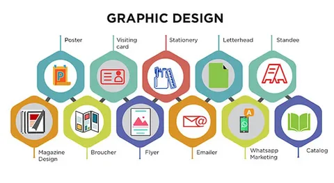
Doing this in-house works until the volume of creative outpaces your team's design skill or bandwidth. That's usually the point at which businesses bring in dedicated graphic design services: an outside team that can apply consistent brand standards across every channel, test variations properly, and keep creative fresh without your marketing manager also trying to be a designer. Agencies working across graphic & design and paid media, such as The Boss Digital UK, typically run this as an ongoing process rather than a one-off project, since ad creative that isn't refreshed regularly tends to fatigue and lose performance within weeks.
FAQ
How do I know if my agency isn't working? If your ad spend keeps rising without a matching rise in sales, and your creative hasn't changed in months, that's a strong signal your current design and media approach needs a review.
What is the ideal number of design elements in a digital ad? Keep it to one headline, one supporting image or product shot, one CTA and your logo. Anything beyond that starts competing for attention.
Does better design really increase conversions, or is it targeting? Both matter, but they solve different problems. Targeting gets the right person to see the ad; design determines whether that person understands the offer and acts on it once they do.
How often should ad creative be refreshed? Most brands see creative fatigue set in within two to four weeks of heavy rotation, so refreshing visuals on that cycle keeps click-through rates from declining.
Can small businesses afford professional graphic design services? Yes. Many agencies offer scalable packages built around a handful of core templates and brand assets rather than a full custom build for every ad, which keeps costs manageable for smaller budgets.
The Bottom Line
Bad design doesn't just look unpolished, it actively costs you sales every time someone scrolls past an ad they don't understand. The businesses winning on paid media right now aren't necessarily spending more. They're spending on creative that passes a five-second test, holds up on mobile, and looks consistently like the same brand every time it appears. Run your current ads through the checklist above before your next campaign goes live, and you'll likely find the fix costs far less than the ad spend it's been wasting.







0 Comments